Elementor Mistakes Beginners Always Make — And Exactly How to Fix Them
Introduction
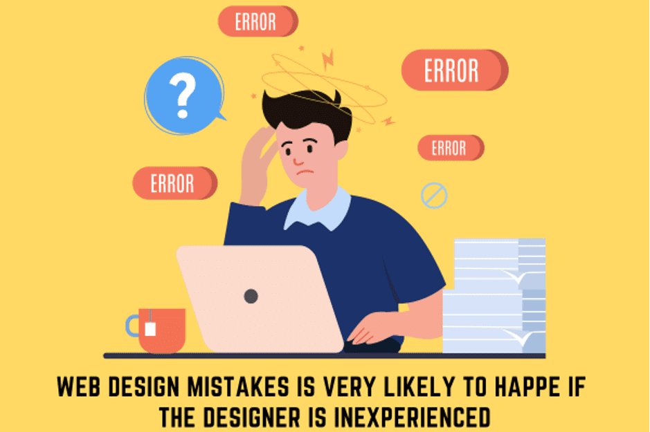
Elementor is one of the most beginner-friendly tools in the web design world. The drag-and-drop interface makes it feel simple, and within a few hours most people can put together a basic page. But simple to use doesn’t mean impossible to misuse. There are five mistakes that almost every beginner makes when starting out with Elementor — and they can seriously damage your site’s design quality, loading speed, and user experience. Here’s what they are and exactly how to fix them.
Mistake 1: Using Too Many Fonts
One of the first things beginners do when they discover Elementor’s font library is experiment with every typeface they like. One heading in a bold serif, another in a decorative script, and body text in a geometric sans—it quickly turns into a visual mess. Professional web design follows a simple rule: use a maximum of two font families on your entire site. Choose one display font for your headings and one clean, readable font for your body text. Set these globally in Elementor’s Site Settings under Typography so they apply consistently across every page. Consistency builds trust; font chaos destroys it.
Mistake 2: Designing Only for Desktop
Elementor has a responsive editing mode with separate controls for desktop, tablet, and mobile. Many beginners design an entire site on desktop, hit publish, and never once check what it looks like on a phone. This is a critical error — over 60% of web traffic globally comes from mobile devices. A site that looks great on a laptop but breaks on a phone will lose visitors instantly. Every time you build a page, switch to mobile view in the Elementor editor and adjust font sizes, spacing, column layouts, and padding specifically for smaller screens before you publish.
Mistake 3: Skipping Global Colors and Style Settings
Before placing a single widget on your page, go to Elementor’s Site Settings and define your global color palette and typography. Elementor lets you save your brand colors so they appear as quick-select options everywhere in the editor. If you skip this step, you’ll find yourself manually entering hex codes for every button, heading, and background — across dozens of elements on multiple pages. It’s a massive time waste. Set your style kit first. It takes ten minutes and saves hours down the line.
Mistake 4: Overloading Pages With Animations
Elementor’s entrance animation feature is exciting for beginners. Fade in, slide up, zoom in — you can apply these to every section, every image, every heading. And many beginners do exactly that. The result is a page that feels chaotic, unprofessional, and slow. Animations should guide the visitor’s attention to key moments—a hero headline, a call-to-action button, a standout feature. Use them on two or three elements per page maximum. Subtle, purposeful motion enhances experience. Animations on everything create noise.
Mistake 5: Never Using the Template Library
Elementor comes with a library of hundreds of professionally designed page templates and section blocks—completely free. Most beginners either don’t know it exists or ignore it and start from a blank page every time. The template library is one of Elementor’s most powerful features. You can import a full landing page template in one click and then customize it with your own content, colors, and images. This approach is dramatically faster than building from scratch, and the templates are designed by professionals, so your starting point already looks polished. Always explore the library before you start building anything new.